Thiink
AI software that helps homes and commercial buildings use, store, and trade energy at the right time—and work together as a more flexible power network.
Product: Thiink makes two products that help buildings manage energy.
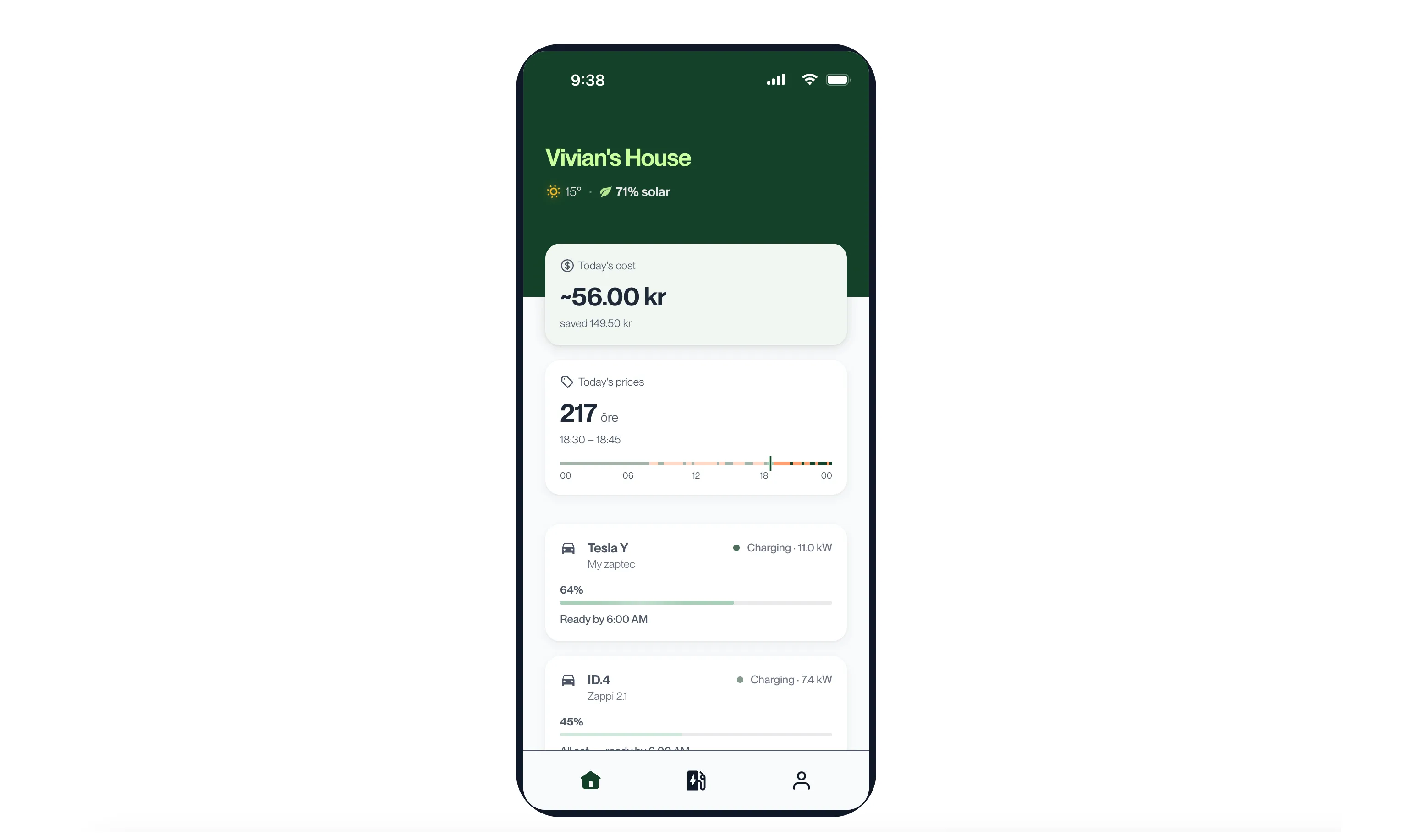
Home AI is a mobile app for homeowners. It predicts the weather, solar production, household use, and changing electricity prices throughout the day. It then decides when the home should use solar power, charge or draw from its battery, charge an electric vehicle, or trade electricity with the grid.
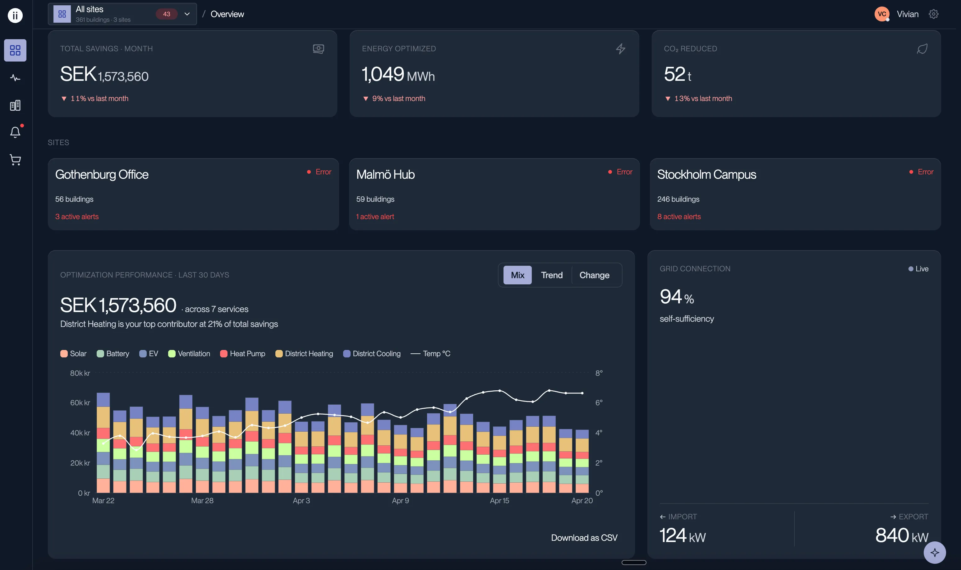
Thiink Enterprise helps portfolio managers and operations teams run many commercial buildings. A web dashboard shows energy use across every site and highlights where attention is needed. Software assistants at each building connect circuits, sensors, and devices, reducing a setup process that once took weeks and continuing to improve how the portfolio uses energy.
How one design system serves both products
One design system serves the green Home AI mobile app and the blue Thiink Enterprise desktop dashboard. Version 0.6 rebuilt their shared foundation. Colors, spacing, type, and other design values live in one set of files that follows the W3C standard for sharing these choices between tools. One command turns those files into the code needed by the web, React Native, and Flutter apps. The products no longer maintain separate copies. Each app chooses three settings—brand, spacing, and light or dark appearance—to produce the version it needs.
The starting values. Eight color families each contain 12 shades for light and dark appearances, alongside a tested set of energy-source colors for charts. Spacing, corner shapes, and type sizes are stored here too. The exact brand colors never change between light and dark.
These names describe where a value is used: main text, a raised panel, the primary button, and so on. Each of the 35 uses points to one shared value. Reusable parts rely only on these names, so their code does not need to know which brand is active.
One file for each brand connects those purpose-based names to its color families. Adding a brand means adding a map, not copying the system. A separate dark-mode map can switch specific colors; for example, Home AI actions change from earth green to mint on dark backgrounds.
Chooses Home AI green or Enterprise blue.
Chooses roomy, compact, or dense spacing and control sizes.
Chooses light or dark. If left unset, it follows the device.
initThiink({ preset: 'homeai' }) initThiink({ preset: 'enterprise' }) The converted files are saved beside the original values. Before code can be committed, an automatic check recreates them whenever a color, spacing value, or icon changes. The tests build everything twice and stop if the results differ, which catches accidental or unpredictable output. The reference website is built from the same files. Its names and guidance come directly from the design-system notes, and it checks the values the browser actually displays. The website therefore cannot quietly disagree with the package used by the products. Controls on every page let designers test each brand, spacing option, and light or dark appearance.
The 23 smallest reusable parts still use the previous design-system names through an older style file included for compatibility. I am moving them to version 0.6 one at a time. A part appears in the reference website only after it uses the new system.
How the products receive design-system updates
The design system lives in one shared package used by four code repositories. Each product chooses a specific package version and upgrades when its team is ready. Both web products currently use version 0.5 and its older style file. Version 0.6 is already used by the reference website and the P1 monitoring app. The P1 app is built with Flutter, so it copies the Dart files created by the system.
thiink/
├── design-system/               # @thiink-llc/design-system, versioned npm package
│   ├── tokens/                  # shared design values stored as JSON
│   │   ├── color/light, dark/   # 12 shades per color family, plus energy colors
│   │   ├── semantic/            # 35 purpose-based names for light and dark
│   │   ├── recipes/             # color maps for each brand and dark mode
│   │   ├── dimension/           # spacing, corner shapes, border width
│   │   ├── shadow/              # shadow choices for light and dark
│   │   └── density, motion, opacity, typography (.json)
│   ├── icons/src/               # original SVG icon files
│   ├── generated/               # CSS, TypeScript, Dart, icons, and documentation
│   ├── src/components/atoms/    # 23 shared interface parts, still using version 0.5 names
│   ├── src/tokens/              # older TypeScript values used by those parts
│   └── site/                    # reference website built from the shared values
│
├── fe-home/                     # Home AI mobile app for homeowners (uses version 0.5)
│   ├── components/              # Home AI interface parts
│   ├── web/pages/               # web prototype screens
│   └── native/app/              # Expo app screens
│
├── fe-enterprise/               # Enterprise desktop app for operators (uses version 0.5.43)
│   └── src/
│       ├── app/                 # pages and shared styles
│       └── components/          # interface parts grouped by feature
│
└── P1-mobile-app-ds/            # P1 monitor: Flutter, blue brand
    └── lib/theme/               # copies of the Dart files from version 0.6.1
Share the foundation, adapt the experience
Enterprise and Home AI use the same colors, spacing rules, type, icons, and small reusable parts. Each product adds only the screens and spacing its own audience needs: a detailed desktop dashboard for portfolio managers and a simpler mobile app for homeowners.
The same button adapts to each product
Both products use the same button code. Home AI applies its green brand and roomier spacing, producing a 48-pixel-high button. Enterprise applies its blue brand and tighter spacing, producing a 40-pixel-high button. The older button still gets its corner shape from a product-specific style file: fully rounded in Home AI and slightly rounded in Enterprise. In version 0.6, the button itself controls that shape.
Home AI
I led the design of the company's first product built around AI decision-making, from early sketches and interactive prototypes through decisions tested with users.
Onboarding
Home AI reads a homeowner's electricity bill to understand their starting energy use and fill in details most people do not know, including their electricity provider, electrical phase, and fuse size.
EV Charger
A homeowner can add an electric-vehicle charger, choose a schedule, limit charging to solar power, or start a one-time charge in Guest Mode even when the usual schedule would wait. The home screen always shows the current charging status.
Thiink Enterprise
A web dashboard gives portfolio managers a live view of energy use across all their buildings and highlights sites that need attention. At each building, software assistants guide setup by identifying circuits, sensors, and connected devices. A person reviews any decision the software cannot make confidently.
Sparky
Sparky is the assistant inside the dashboard, built from start to finish in one week. The difficult part was not making a chat box; it was proving that its answers were dependable. Every answer goes through two levels of testing. An AI model from a different company grades the answer without seeing the expected response. It compares the answer with a written minimum standard, so one seriously bad response fails the whole test run instead of disappearing inside an average. Four deliberately wrong answers are mixed into every check to expose a grader that is too generous. Every time an operator marks an answer unhelpful, that response becomes a new test for future versions.
Set up a building with software assistants
Software assistants move each new building through setup: they find circuits, identify sensors, and connect devices. When the evidence is unclear, they stop and ask an operator to decide.